
Perception of Colors—and the Words We Use to Describe Them
Hannah Mulcahy | March 12, 2025
The way we categorize color varies significantly from culture to culture across the world, and the history behind these categorizations is far more interesting than might be expected. Russian speakers, for example, will perceive a distinction between light blue (Голубой goluboy) and dark blue (синий siniy), while English classifies these as two subcategories of the same color. These slight differences in perception are a window into our thought and language processes and can tell us a lot about the different ways that language communities perceive the world around them. Also, understanding how these seemingly small aspects of language contribute to shaping our collective narratives and worldviews might help us navigate the increasingly polarized nature of our conversations and global discourse into the future.
Brent Berlin and Paul Kay transformed the field of color linguistics when they proposed their 1969 color word theory, suggesting that humans create color terms in a similar pattern cross-culturally. Berlin and Kay’s research into the evolution of color words focused on 20 languages, including Tzeltal (a Mayan language from southern Mexico), Tagalog, Hebrew, Spanish and English. The results indicated that color words are not arbitrary at all, but that languages establish color words in a specific order, as seen in the following figure, moving from left to right:
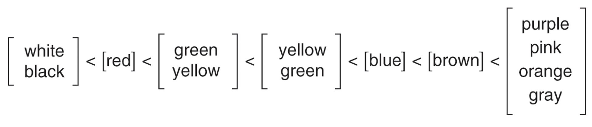
Berlin and Kay’s study proposes that this order of distinguishing between colors comes from the evolutionary need to categorize your environment with the most useful distinctions first to ensure survival. This intuition indicates a biological foundation to color word evolution and does not vary much across cultures, demonstrating how this hierarchy of color names reflects the cognitive and perceptual development of the human race. This would explain why the color red is one of the first colors to receive a name (after black and white) as red was (and often still is) associated with violence and danger due to the color of our blood. When it comes to survival, the color of blood is very significant and would, therefore, receive a name before something less essential like a distinction between light and dark blue. These findings shine a light on the universal human experience.
In spite of that, what’s even more fascinating is that what we perceive as color isn’t actually color at all. As Robert Ornstein explains in his book The Evolution of Consciousness, “what is seen as color is wavelengths of light reflected from different surfaces. These wavelengths stimulate three kinds of cones in the retina, which in turn send their coded information to the brain. The experience of color is a product of the coding in sensory systems. That we see red, green, blue and yellow as ‘pure’ is the result of the way wavelengths of light are processed by the nervous system and not because of any intrinsic property of the light being processed.”
So, while most of us physically see color the same way, the way these wavelengths of light are culturally and symbolically seen can have completely different meanings. When a symbolic meaning is attached to a color, this association can be seen everywhere; from art, fashion and literature to national flags and traffic lights. For example, today, red still embodies passion and danger in Western cultures, while it is a symbol of good luck and happiness in China and is heavily associated with the celebration of the Chinese New Year. The color white symbolizes purity in most Western cultures, while in some parts of Asia, white is the color of mourning.
These symbols reinforce our individual mental models, which process and organize internally what we see and experience externally. This structuring influences how the world around you is perceived. As human beings, we all want to understand what goes on around us and, in order to do this, we categorize what we see into groups, such as sizes (small, medium and large), or associations (red means danger, white means cleanliness and black means mourning, for instance). These compartments of our lived experiences improve our knowledge of what to expect from our environment and predict what we may encounter next, helping us maintain a stable world in our minds.
Questions about color vocabulary in ancient languages have persisted in academia for centuries. Homer’s famous description of a “wine-dark sea” in The Odyssey and The Iliad has been discussed and theorized by linguists and scientists alike; former Prime Minister William Gladstone was one of the first to study Homeric color words in detail in the 1850s. In line with Berlin and Kay’s 1969 color theory, the ancient Greek words for white (leukos) and black (melas) appear much more frequently than any other color words in Homer’s poetry. Red (erythros) appears with the third most frequency, followed by yellow (xanthos) and then purple or violet(ioeis). Strangely, Homer refers to sheep, iron and Odysseus’s hair as violet-colored, as well as using the word for green (chlóros—from where we get the words “chlorophyll” and “chlorine”) to describe twigs, olive-wood, honey and human faces full of fear. In fact, the color blue does not appear in Homer’s work at all, at least not in the way we would use it.
William Gladstone’s research into Homer’s seemingly odd use of color words led to a number of hypotheses, the most likely one being that ancient Greek simply did not have a word for the color blue at that point. Having said that, it still doesn’t quite explain the choice to describe the sea as “wine-dark,” hence we must consider that the ancient Greeks perceived color very differently to us. That’s not to say that purple sheep or green honey existed in Homer’s day, or that the ancient Greeks’ nervous systems processed wavelengths of light differently to us, but it reveals how the complexities of a culture result in different perceptions of color and, consequently, dictate the evolution and use of color words for future generations.
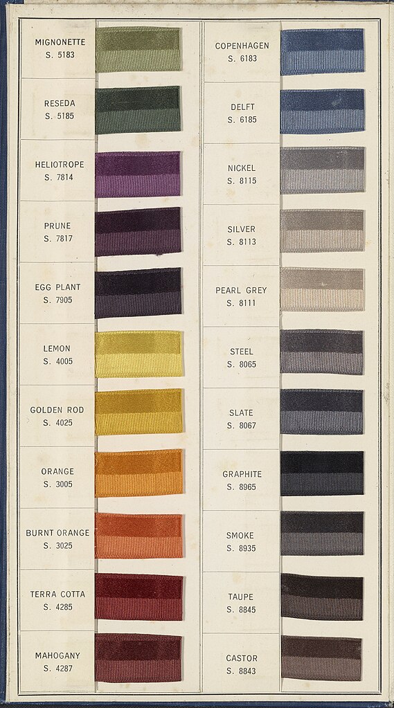
Since industrialization and the emergence of digital media, our color vocabulary has dramatically expanded. Today, we have words like chartreuse, mauve, teal and magenta which describe very specific shades of the basic colors green, purple, blue and pink. Due to the rise of the fashion industry and marketing technologies, our perception of color is constantly being influenced and broadened, illustrating how color perception is informed by a cultural demand. In this case, there was a need to expand the fashion, art and media industries to include more color labels in order to keep up with a growing interest in these fields and maintain their general perception as exciting and new.
The way we see and categorize color reflects changes in our culture, cognition and communication. The cross-cultural variations seen here prompt us to ask ourselves whether our language restricts what we see, or does what we see govern our language?
Hannah Mulcahy is final-year undergraduate studying linguistics and modern languages, specialising in sociolinguistics, including language policy and language attitudes and perceptions, at the University of Sheffield in the UK.
Beyond Culture:
Edward T. Hall, after spending his early adulthood working and travelling among non-Anglophones, both in the United States and in other parts of the world, became cognizant and fascinated in the deeper layers of culture that he claimed lie buried beneath those more obvious forms.

Recent Field Notes
- Proto-Indo-European: The World's Parent Language
- What AI Can't and Shouldn't Replace
- When Numbers Trick the Mind
- Community Health Workers: Bridging the Gap in Underserved Communities
- Building a More Playful World
- Bird Flu: Another Pandemic in the Making?
- Perception of Colors—and the Words We Use to Describe Them
- China's 2060 Carbon Neutrality Goal: An Unrealistic Dream?
- Tropical Cyclones in a Warming World